Ok you’ve got your quote of choice, now how do you decide what lettering style to use? Print? Calligraphy? Loose calligraphy with flourishes? All of the above? Let’s figure it out together!


Thinking what paper to use for your beautiful designs? You can't go wrong with this option!
Step 1: Assess your quote
If it has more than 10 words or so, mixing styles can look a bit chaotic and confusing, so I suggest sticking with one. If you’re in the 3 to 10 word range, keep reading! If it’s more than 10 or so, I recommend sticking with one lettering style.

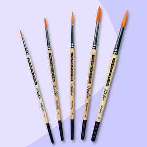
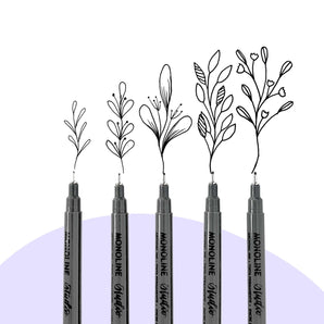
Need a perfect pen for your hand lettering project? Look at these cuties!
Step 2: Establish your vibe
With a short quote, there are several options. Choosing between these options depends on a few factors:
1. How many lettering styles do you feel confident in?
2. How much time would you like to spend on the piece?
3. What vibe are you going for? Elegant? Cutesy? Classic?
If your answer to question 1 was one style, that’s the one you’ll use!
(See samples 1, 2, or 3). If you answered several styles, you’ll want to pick one print style, and one script style. (See sample 4). More on that later.
If your answer to question 2 was not very much time (less than an hour), you’ll want to pencil out some straight lines, and follow those lines for your print. (See samples 1 and 3). If you have no limit on time, I recommend starting with some lines, but then using the various details of each letter to fill in negative spaces throughout the piece. (See samples 2 and 4)
Deciding on the vibe you are going for largely depends on the lettering style or styles you plan to use. Samples 1 and 3 would likely fall under the “classic” or “simple” category, whereas sample 2 might fall under the “elegant” category, and 4 more on the “cutesy” side. These looks can be altered significantly with whatever style you choose to write with.
Adding flourishes or extra space between letters can increase the sophistication of the piece, while adding more lettering styles, banners, shapes, etc. can make the piece seem more like a drawing or illustration.


Step 3: Pick your lettering styles
It is important when mixing styles to make sure there is a lot of variation between them. If you look at Sample 5, you’ll see that the slight variation between the two print styles looks more like one inconsistent style than two unique styles that stand out. Same with sample 6. The bouncy calligraphy just looks like a slightly sloppier version of the classic calligraphy. Looking back at sample 4, you’ll see enough variation that not only are they 2 clearly different styles, but the more significant words in the quote stand out much more.


Step 4: To fill or not to fill?
The negative space, that is. If you look at sample 1, the design is very clean and organized, but there are occasional gaps between the lines ( about the word ‘you’ for example) that we could fill (like I did in sample 2). This will take some extra time (and erasing) but creates a much more completed look.
To do this, start by laying out your quote similar to sample 1. Pay attention to any letters that go below the baseline or above the midline as those will help you fill in spaces. Once you’ve got it all penciled out and centered, start erasing and moving some letters up or down. Don’t move any letters too much as this can make things less readable. In Sample 2, you’ll see that the bodies of the letters are almost all lined up, but the ascenders and descenders get a little bouncy to fill in the negative space. Play around with this for a while until everything seems to fit and doesn’t look too chaotic. If some letters just don’t work well together, feel free to experiment with flourishes in there!
I’ve done something similar in sample 4. In this kind of layout, it’s easiest to draw straight lines, write the script words first, and then the print words, making some of the letters a little taller or shorter to fill in the negative spaces of the script.


If you’ve got lots of time and are wanting more of an illustrated look, check out sample 7! Here I’ve used 4 different lettering styles, but I’ve separated them with flourishes, a banner, and line thickness variations. This look leaves room for the most creativity, as you can add all sorts of different doodles and design touches in there.

I highly recommend trying out all of these options with the same quote to really get an idea of what your preferred vibe is. I’m all about sample 2 and 4, but love when other artists use different looks! All of these variations are a great thing to discuss with a client looking for a custom print. If someone has sample 7 in mind, but has a very small budget, you may have to explain the difference in time between sample 1 and sample 7. This is definitely a conversation worth having before creating the print so that all expectations are out on the table.
Most importantly, enjoy the process!

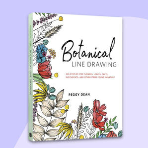
Looking for more ideas? We have the perfect book for you! Get yourself The Ultimate Brush Lettering Guide by Peggy Dean and thank us later!
Hi there! Kelly from Letters & Lattes here! I’m a hand letterer who specializes in teaching others how to letter using workbooks, classes, tutorials, and lessons. I also create custom prints and personalize all sorts of items!
If you have any questions or need help, don’t hesitate to reach out! You can contact me via Instagram @lettersandlattesllc or email me and I’ll respond ASAP.
Have fun!!
♥️ Kelly
Pin this blog post for later to make sure you can always refer to it.