Unique Color Palettes on Procreate + FREE Worksheet
Unique Color Palettes on Procreate + FREE Worksheet
Today we are going over how to make your very own original color palettes! That way, you can make ALL kinds of color palettes, literally whenever you want, for yourself or maybe as a gift to a fellow creative! The gift-giving season may be over, but honestly, can we just do presents all year?!
One of my favorite Friday freebies to send out are color palettes, which you probably already know if you're subscribed to my emails. If you aren'tget on it! There are SO many freebies waiting for you. For the sake of changing things up a bit, I've decided to give you the gift that keeps on giving.
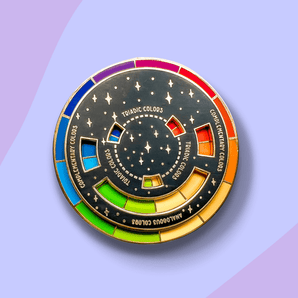
For this tutorial, I have ALSO included acolor palette worksheetmade by me, to help you guys get all the right colors that flow together and complement each other! This worksheet has made my life so much easier and I know all of you will benefit from it too.
To make it easy peasy, I've created a customizable template for you right here. Download it and import the image into your Procreate gallery. This worksheet has made my life so much easier and I know you will benefit from it too.
For this process, I'm not going to be using any reference images to pick my colors from, and I'm solely basing it on what colors I like! Luckily, Procreate is going to do a lot of the heavy lifting for you so you only really have to decide on one color for now. Try really mixing it up, there are no rules here! Rules ain't cool.
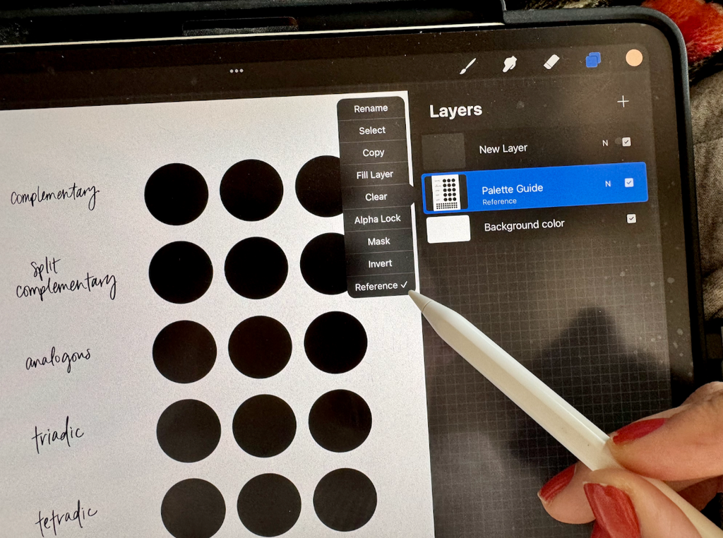
Step 2: Start by picking a color you know and love and create a new layer
Create a new layer on top of the palette guide. Tap the original layer and select Reference. Now, when you move to other layers, they'll act as if it's happening to the original layer, but instead it's preserving it, working indestructibly so you can use it again and again. Watch this video for an example.
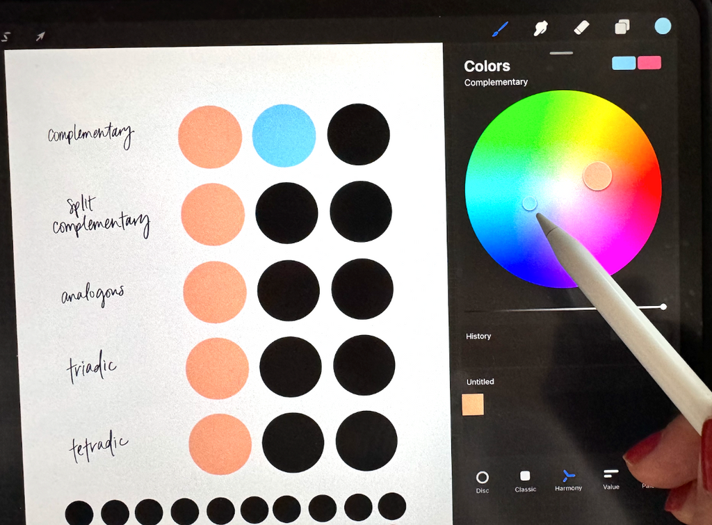
Start your color journey by picking a color you know, you love and you hold close to your heart. That's the color you're basing the rest of your palette off of! I decided to choose an obnoxiously loud green. Don't overthink this part, just pick a color that draws you in! Create a new layer and drag it on top of the reference layer (the worksheet). Drag and drop your chosen color into the circles under the main color tab (to the left, to the left).
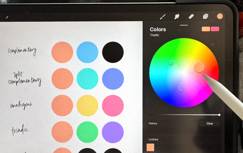
Step 3: Open the color harmony tool
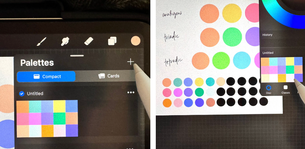
Now, this part isn't super obvious, but it's a cool feature that Procreate has in its color interface (anddd it's a sure way to make a color palette that doesn't suck)! Go to your color wheel and select "harmony" at the bottom,
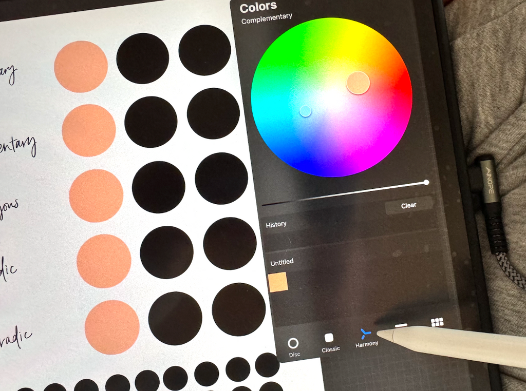
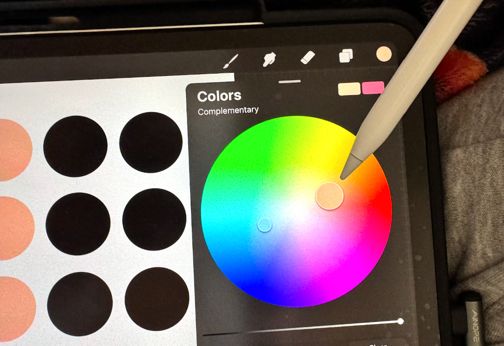
On the top left of the color menu, you'll see the word Colors (if you've never explored this setting in Procreate, underneath the word colors, it will most likely read “Complementary” but we'll be using ALL of the color settings to put together our worksheet – more on this in a moment).
Notice that I still have the peach color selected (the larger of the two circles) but Procreate shows me the exact opposite color that would complement the peach. Select that color and add it under the "complementary" column. Even if you hate it, add it for now and we can make changes later!
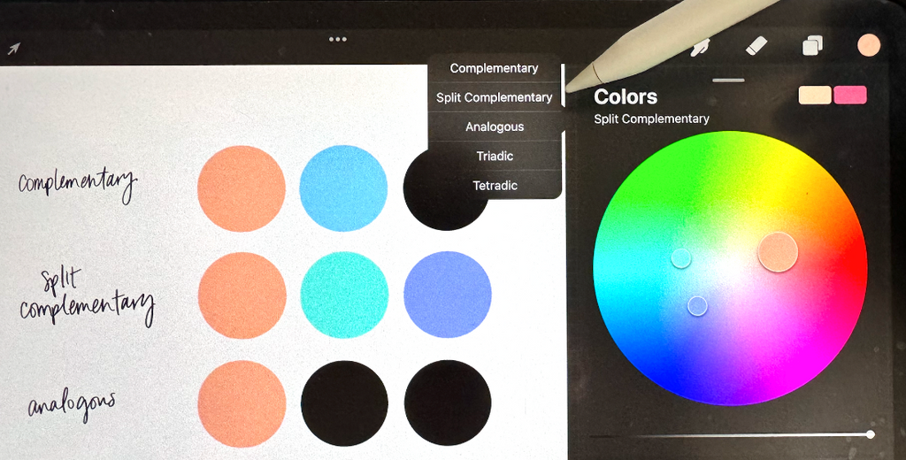
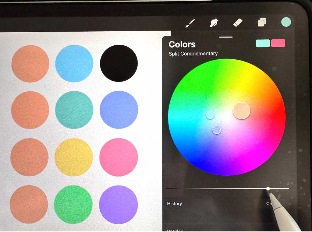
Step 4: Select your original color again and change your harmony setting to "split complementary"
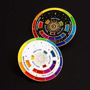
If you're not familiar with color theory, complementary (what we just used in the last step) is the color that's the exact opposite of your color on the color wheel. Split complementary colors are still opposites on the color wheel, but split to the sides, making three total colors harmoniously balancing each other.
To access this color harmony guide, tap under the word Colors in the Harmony color interface and select Split Complementary.
*IMPORTANT* Because we just grabbed the complementary color, you might still be on that hue. Make sure you have your ORIGINAL color selected before snagging the next colors.
Grab each of these colors and drag them to the split complementary area of the template.
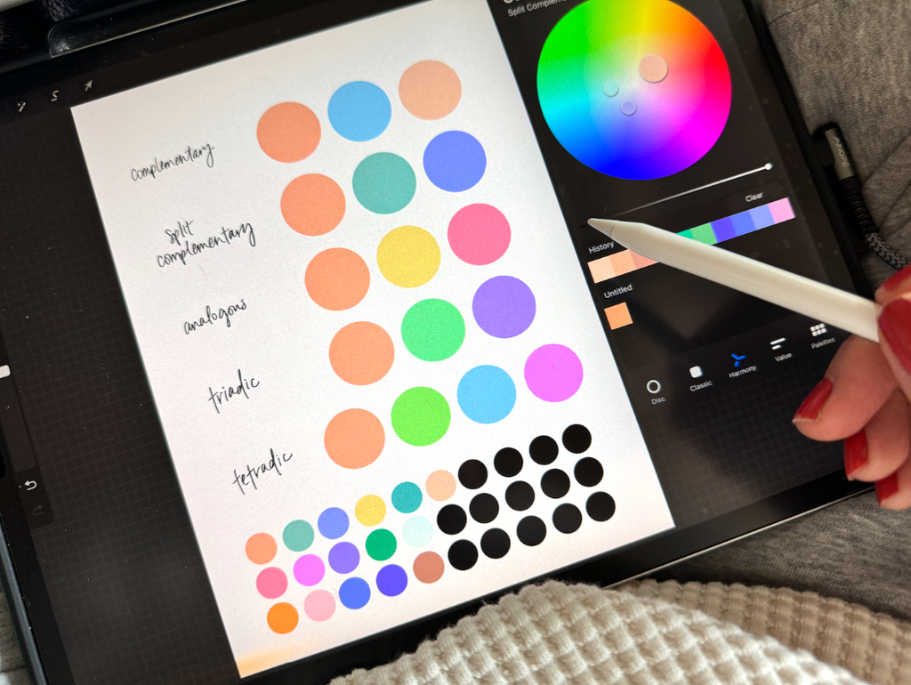
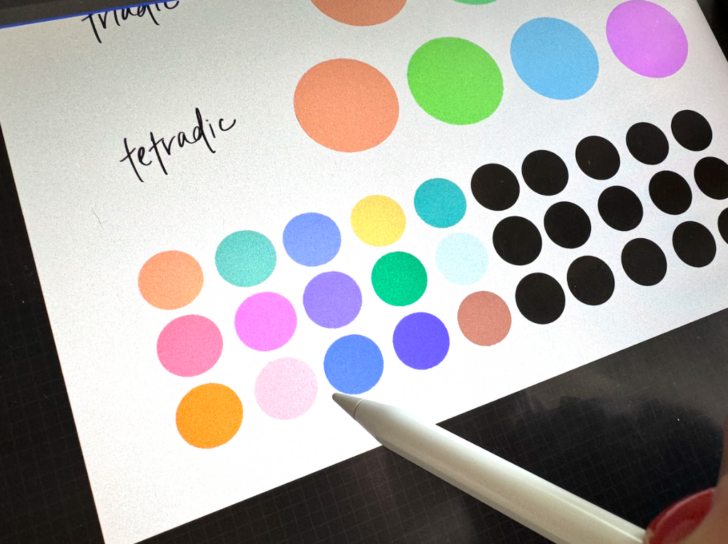
I put these categories in a row together because I generally like how these look altogether. It's kind of a monochromatic scheme of complementary colors!
Step 5: Pick your monochromatic colors
The monochromatic colors located at the bottom of the worksheet are going to be the separate shades of your original color. Make sure you have your original color selected and go to your disc. Inside the color wheel, it gives you the option to change the saturation and shade, instead of the hue. So you can stay within that original color!
I chose to go with a deeper green color and a lighter, almost minty, green color.
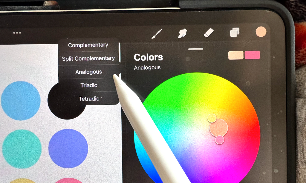
Step 6: Pick your analogous colors
Cutie pie reminder again: Make sure you have your original color selected before moving to the next step.
Change your harmony to Analogous. Grab the colors it shows and drop them into the analogous section of the worksheet. The analogous colors are like monochromatic colors with flair because they offer a different hue of your original color and that's what I love about them. Essentially, they are colors that sit next to each other on the color wheel.
Step 7: Pick your triadic colors
Select your original color again and change the harmony to Triadic. This is where your palette is spread exactly even amongst three points. Grab the colors the wheel gives you and drop them into your triadic color spaces on your template.
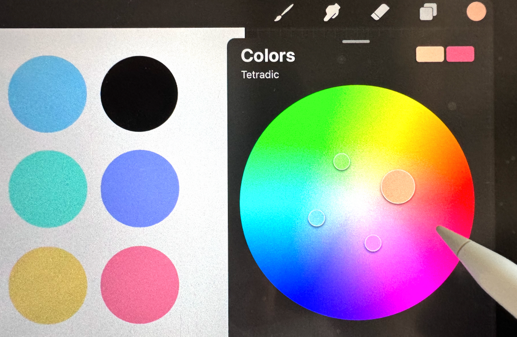
Tetradic colors are split evenly into fours on your color disc. Make sure to have your original color selected so you get all your tetradic colors right! Drag and drop the tetradic colors into your worksheet.
Step 9: Make any adjustments to colors you aren't happy with
Now's the fun part! If there are colors you're not thrilled about within any of these category, now is the time to switch it up.
For me, I'm not a huge fan of bright aqua blue in my split complementary row, so I'm going back to the Split ComplementaryHarmony to alter the shade of that blue. This is where we break rules. The colors you select will still be applicable to its category, but it'll be more of what you actually like.
Select a version of the color that you don't necessarily feel filled with glee about, You can play around with the shade of the color even more.
Don't stop at hue and tint. There's a dark to light shader bar just under the color disc. Drag that down for a more subdued hue. That's how I found a much more suitable teal for my Split Complementary section.
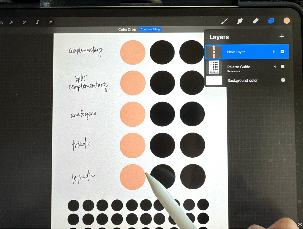
Step 10: Begin building your palette
Drag and drop any colors from the worksheet you love into the bottom palette (still working on the worksheet). We're OFFICIALLY almost finalizing our original palette! It doesn't really matter where you set up the bottom palette because it will be used as a reference sheet to fill in your actual color palette spots within Procreate.
Remember: When building your palette, you'll have more colors than you'll actually use in one art piece. And, you're not going to use ALL the colors in this palette, so if there are a few colors you aren't thrilled about, don't take an hour changing them around.
Grab the colors from your worksheet and play around with saturation, shades, and hues. Drop-in your experimental colors at the bottom to see if you like the way they look with your other colors!
Step 11: Finalize your palette!
To create a new palette, simply open your color palettes, select the + symbol at the top. From your practice color palette area, select each color from the worksheet with the eyedropper (by default, the eyedropper aka color selection is done by holding your finger down on the color), and drop it into your color palette on the right side by tapping a square! Last but not least, give your color palette the coolest name of all time.
And that's where your NEW and ORIGINAL color palette will live.
This tutorial was SO fun to create for you all and in my opinion, this is one of the best features on Procreate. I just love playing with color oh so much. Creating original color palettes is a great way to organize yourself for a particular project AND get you to use some color combinations that maybe you usually wouldn't.
Trying new things isn't always easy, butthis color palette worksheet (freeeeee direct download) definitely makes it a little better!
If you're ready to continue levelling up your Procreate skills, I've got just the course for you! I'm so over-the-moon happy that Procreate Lettering Lab has now opened its doors for enrollment.
A get-your-hands-dirty hand lettering coursepacked fullof style exploration discovery labs, and step-by-step workshops so you can uncover and refineyourunique styles(yes, plural).
You don't have to be stuck in one style or technique. You don't need to take 50 different classes, either.
Learn why sticking to traditional hand lettering rules might actually be limiting your creativity. Discover how tweaking weight line placements can actually...