
Let’s chat about something that might cause an opinion or two—weight lines in hand lettering. Spoiler alert: sticking them on one side only and calling it a day isn't going to cut it. Allow me to expand on that.
Why lettering weight lines are actually your secret weapon
Case Study: The Tale of a Messed Up ‘M’
*watch video 👆 example*
Let’s dissect this like we’re in a high school biology class. Draw a proportionate ‘M’ and slap the weight on the right. Looks good?
Now try another 'M,' but this time the right side makes it look like it’s squishing itself into an awkward party conversation. It's not like you meant to do it. It was an oopsie. We all make them. But what if you're working on paper and you can't do a two-finger undo ...
It's still salvageable. See what I mean? Flexibility is key.
Here’s a step-by-step hand lettering approach to deciding where to place your weight lines:
-
Evaluate the letter structure: Look at the unique characteristics of the letter and how its connecting points interact.
-
Experiment with placement: Don’t be afraid to try weight lines on different sides of a letter's strokes to see what looks and feels right.
-
Consider the visual impact: Choose the option that enhances legibility and aesthetic appeal.
-
Mix it up: Experiment with different letters. Throw in some curves, some edges—you know, keep things spicy.
-
Sketch it out: Keep a sketchbook (digital or analog) as your secret weapon. It’s your lab for mad lettering experiments 🧪
Weight lines are a powerful tool in hand lettering that, when used creatively, can significantly enhance the impact of your artwork. Hand lettering is as much about expression as it is about following rules.
Remember, rules in art are more like guidelines, so feel free to color outside those lines—literally.
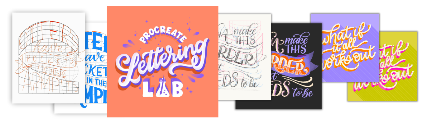
Thirsty for more lettering lore? Join me in Procreate Lettering Lab, where we'll break even more rules in style and redefine what digital lettering can be. Let’s create something unforgettable together.


)