Lately, I’ve been obsessed with nature’s colors and I found a cute flower as a mother’s day gift. But first, I had to play with it! I got really inspired by the colors of the petals so that was the idea to go a little deeper.
The title of this tutorial says ‘flower study’, but please do not be afraid because it is really just a game to enjoy the process and play with the layers and different hues. Follow me along or just use this project as an inspiration for your next idea!
Let’s do it!
Supplies
- Watercolor paper (for the final piece I used size A5)
- Watercolor brushes, synthetic round ones (number 1 and 4)
- Glass of water
- Paper towel
- Pencil (HB)
- Watercolor pigments – I used a small travel palette
- Washi tape
- White porcelain plate – as a palette
Step 1: Explore Colors
I decided to make a little color study first, just to see how can I recreate the colors of the petals. I mixed some of it and turned out to be great colors I love.

For the petals, I mixed Madder Lake Deep with Payne’s Grey for a purple color and Burnt Sienna plus Yellow Ochre and Permanent Light Red for another hue. These two were the basis of my petals: purple and yellow mix.
For the stems, I used Azo Yellow Medium and Burnt Sienna mix as a background.
For the green parts, instead of using the green from my palette, I mixed Ultramarine Deep and Azo Yellow Medium to make my own shade of green. For the darker hue, I also put some grey into the mix.

Need more nature watercolor inspiration? Grab Peggy Dean's best-selling guide here.
Step 2: Paint Petal Shapes

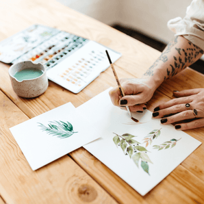
To get ready for the final painting, I created a paper where I tried my color ideas and sketched the parts of the flower to practice a little bit first. As you can see in the photos, I drew a flower, one petal and leaves and tried my colors there. It doesn’t matter how you draw, just make a sketch for yourself and play a bit with the hues before you jump into your final piece. Think about it as a warm-up - if you draw, you understand the shapes of the flowers better and your hands will learn all the little details from muscle memory.
When I started to paint the petals, I used the rose mix as a base and yellow mix as a second layer and a little deep purple on the edge. I practiced wet on wet technique, so all the three layers blended a little bit together.
PRO TIP: Always start with light colors and you can darken them layer by layer.

I used the same method for the bud, and the green parts, too.
For the leaves as a first layer, I used a yellowish-green (I mixed Ultramarine Deep and Azo Yellow hue for green and in this case I used more yellow than blue – that’s why it looks more like yellow.) As a second layer, I played with a green hue with more blue in the mix, and put some grey into for the darker areas. I used the wet on wet technique and started to use a second layer before the first dried. If it’s already dry – no problem, go back with a clean wet brush and put a water layer on. Now your surface is wet again.

Step 3: Practice Composition

As we are familiar with the shapes and the colors of our subject, only one step remains the final part of the project! I created a composition – like a view from above a flower or bouquet. I used really simple shapes and easy sketches because we only need a little guidance as pencil lines. The essence of the composition is coming from the colors: the hues and the different pigments catch each other and create new hues and dimensions. This is the most exciting part of this project, or any watercolor project. You can see that I paint in a realistic way but I do not follow all the real details while I am painting. I encourage you to the the same: study your subject, but don’t forget to play and try your ideas, and melt them into the composition!
PRO TIP: tape down your paper to the desk – it’s easier to work with it later, and it's not going to be too wavy because of the water you use.

Step 4: Paint the Bouquet
- Flowers - first layer light rose, second: yellow, third: deep purple for the dark areas and details – as the horizontal dark lines on the petals, and dark edges.
- Leaves - first layer light yellow, second: darker with more blue, third: darker with more blue plus grey for the shadows, darker areas, accented details.
- Stems – yellow for the dots (I used two layers – let the first dry and come again with the yellow) and Burnt umber for the background of the dots.
- For additional small flowers – I used only one layer, a rose one, and some greens for the stalks.
Between layers, I paid attention leaving wet layers to work on for the next one - in this case, they blend easier.
PRO TIP: I chose to leave the background as white as it is, but feel free to experiment with painting it too if you think about a dark value, it’s easier to paint the background first, let it dry, and start the whole composition afterward.

I hope you enjoyed this flower project as much as I did and gave yourself time to play.

My name is Reta (Margareta), I am a self-taught watercolor artist and teacher, my favorite subject is botanical illustration. I love all the plants and flowers, it feels relaxing to study and paint them, and I try to give this perspective to all my students to slow down a bit and enjoy the details. My business called @studioreta where I design wedding invitations, kid’s products, botanical art prints, original paintings, stationary and so on and on. ☺ I work as sustainable as possible, because nature is my endless inspiration.
Enjoyed this post? Pin for later!


