I'm excited to share some of my favorite color techniques with you today that have helped me take my artwork to the next level. I think you’re going to be quite pleased with what you’re about to implement after this quick video.
And I need your reply at the end so hang tight!
Whether you're an experienced artist or just starting out, I want you to consider this a challenge. Dare I say, a dare..?
I’ve got 7 exercise items and I want you to pick 2 to implement this week. You just might reignite your passion for color and love your work even more. And who knows, they might just become your new favorite go-to methods.
#1 Use Complementary colors to make your art POP
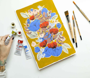
Did you know that using complementary colors can create a dynamic contrast in your art that draws the viewer's eye and makes your work stand out?
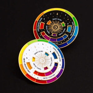
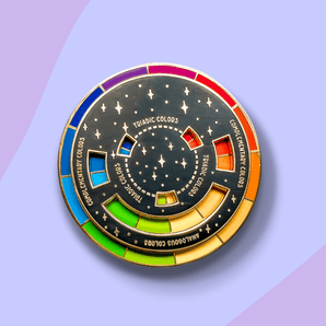
Complementary colors are opposite each other on the color wheel, such as blue and orange, violet and yellow, or red and green. Using these opposite colors together creates a sense of energy and excitement, making your artwork more visually engaging and impactful.

#2 Play with color temperature to create mood
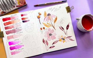
Did you know that warm and cool colors can create different moods and emotions in your artwork? Warm colors like red and yellow can create a sense of excitement and energy, while cool colors like blue and green can create a calming and relaxing mood.
By understanding the emotions you want to convey in your art, you can experiment with different color temperatures to create a more immersive and emotionally resonant piece. Whether you want to create a bold and energetic piece or a soothing and calming work of art, color temperature can help you achieve your creative vision.

#3 Use Monochromatic Color Schemes for a Sophisticated Look
Did you know that using different shades and tones of the same color can create a sense of unity and sophistication in your art?
A monochromatic color scheme involves using different shades and tones of the same color, creating a cohesive and elegant aesthetic. This technique works particularly well in minimalist or abstract art, where the focus is on subtle variations in tone and texture. By using a monochromatic color scheme in your artwork, you can create a sophisticated and refined look that stands out from the crowd.
#4 Experiment with color blocking
Blocking areas of your art with different colors can create a bold and graphic effect that draws the viewer's eye. Color blocking involves using different colors to block off areas of your art, creating a bold and impactful graphic effect. This technique is popular in modern art and design, and can be used to create a powerful visual statement in your work.
By experimenting with color blocking in your art, you can add a new dimension to your work and create a more impactful and visually engaging piece.

#5 Play with opacity and transparency
Using opaque and transparent colors in combination can create interesting depth and texture in your art. opacity refers to how much light can pass through a color, while transparency refers to how easily you can see through a color.
By using a combination of opaque and transparent colors, you can create interesting layering effects, adding depth and texture to your work. Whether you want to create a dreamy, ethereal piece or a bold, graphic statement, opacity and transparency can help you achieve your creative vision.
#6 Use Color Psychology to Influence Perception
Did you know that certain colors can evoke specific emotions and moods in viewers, and that understanding color psychology can help you communicate your artistic message more effectively?
This is where I’ve been most excited to bring you through in this overview. I might be mildly obsessed with color psychology because I know how it makes ME feel. Color psychology is the study of how colors affect human behavior and emotions, and by using these principles in your art, you can create a more impactful and emotionally resonant piece. Whether you want to create a sense of excitement, calm, or something in between, using color psychology strategically in your art can help you achieve your creative vision.

I’ve got a cheat sheet for you to download that lists the primary emotions related to each main color family. I’ve got the same one hanging in my studio space all year long and I’m excited to share it with you.
#7 Incorporate color symbolism to add deeper meaning
Different colors can have symbolic meanings, and that using color symbolism in your art can add layers of depth and meaning for viewers to interpret?
Colors can have both universal and cultural meanings, and by using colors with specific symbolic associations, you can create a more nuanced and layered artistic message that invites viewers to interpret and engage with your work on a deeper level.
Whether you want to convey passion, tranquility, or something else entirely, incorporating color symbolism in your art can help you communicate your message more effectively. This is a deep dive for another day, though. (Although I’d gladly keep you here to talk about it for hours).
Now, I know these color techniques continue to surprise and delight when you continue revisiting them. You’ll find that you’re elevating your creative vision each time you make art with color science in mind.
Now, I want to hear from you:
🎨 Which of these color techniques have you tried?
🎨 Which one(s) are you most excited to try in your artwork?
🎨 What struggles come up for you the most when it comes to color?




I’ve used complementary colors often. Not so on the other techniques, except for color temperature in my Photography.
I’m most excited about trying monochromatic color schemes. Sounds interesting and in line with my tastes. .
Extra note which may or may not be related: I love the Gradient mapping in Procreate.